Mobile First Web Design for Family Lawyer: Why It Matters
When someone needs a family lawyer, they’re rarely sitting calmly at a desktop computer during business hours. They’re searching on their phone late at night after a difficult conversation. They’re looking up divorce attorneys on their lunch break at work. They’re finding custody lawyers while sitting in their car, trying to hold it together.
This is the reality of how people find family lawyers today, and it’s why mobile first web design for family lawyer isn’t just a nice to have feature. It’s the difference between capturing a potential client in their moment of need or losing them to a competitor whose website actually works on their phone.
In this comprehensive guide, we’ll explore why mobile first web design for family lawyers matters more than ever, what makes it effective, and how to ensure your website serves clients when and where they need you most.
The Real Estate Web design features that are Worth Your Investment
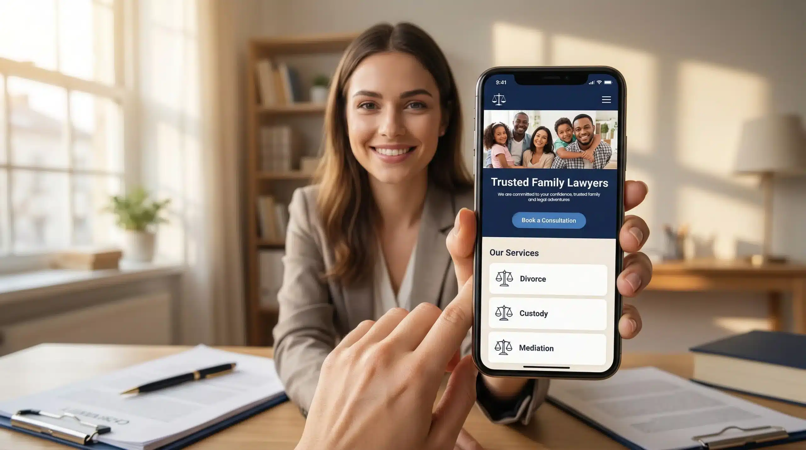
Let’s break down the specific features and design choices that make web design for family lawyer effective on mobile devices.
One Tap Calling
Why It Matters:
When someone finds your website on their phone and decides they need to talk to you, the last thing they should have to do is memorize your phone number, exit the browser, open the phone app, and manually dial.
Implementation:
- Place a prominent click-to-call button in the header that stays visible as users scroll
- Make the phone number the most visually prominent element on mobile
- Consider adding a floating action button (FAB) that stays accessible throughout the site
- Use tel: links so tapping the number automatically initiates a call
Simplified Navigation
Why It Matters:
Complex dropdown menus and extensive navigation options don’t work on small screens. Mobile users need clear, simple pathways to critical information.
Implementation:
- Limit main navigation to 4-5 key items maximum
- Use a hamburger menu for secondary pages
- Implement a sticky navigation bar that follows users as they scroll
- Make tap targets at least 48×48 pixels (Apple’s recommended minimum)
- Ensure adequate spacing between clickable elements (nobody wants to accidentally tap the wrong link)
Priority Pages for Family Law:
- Home
- Practice Areas (divorce, custody, support)
- About/Attorney Bio
- Contact
- Resources/Blog (optional)
Forms Optimized for Mobile Input
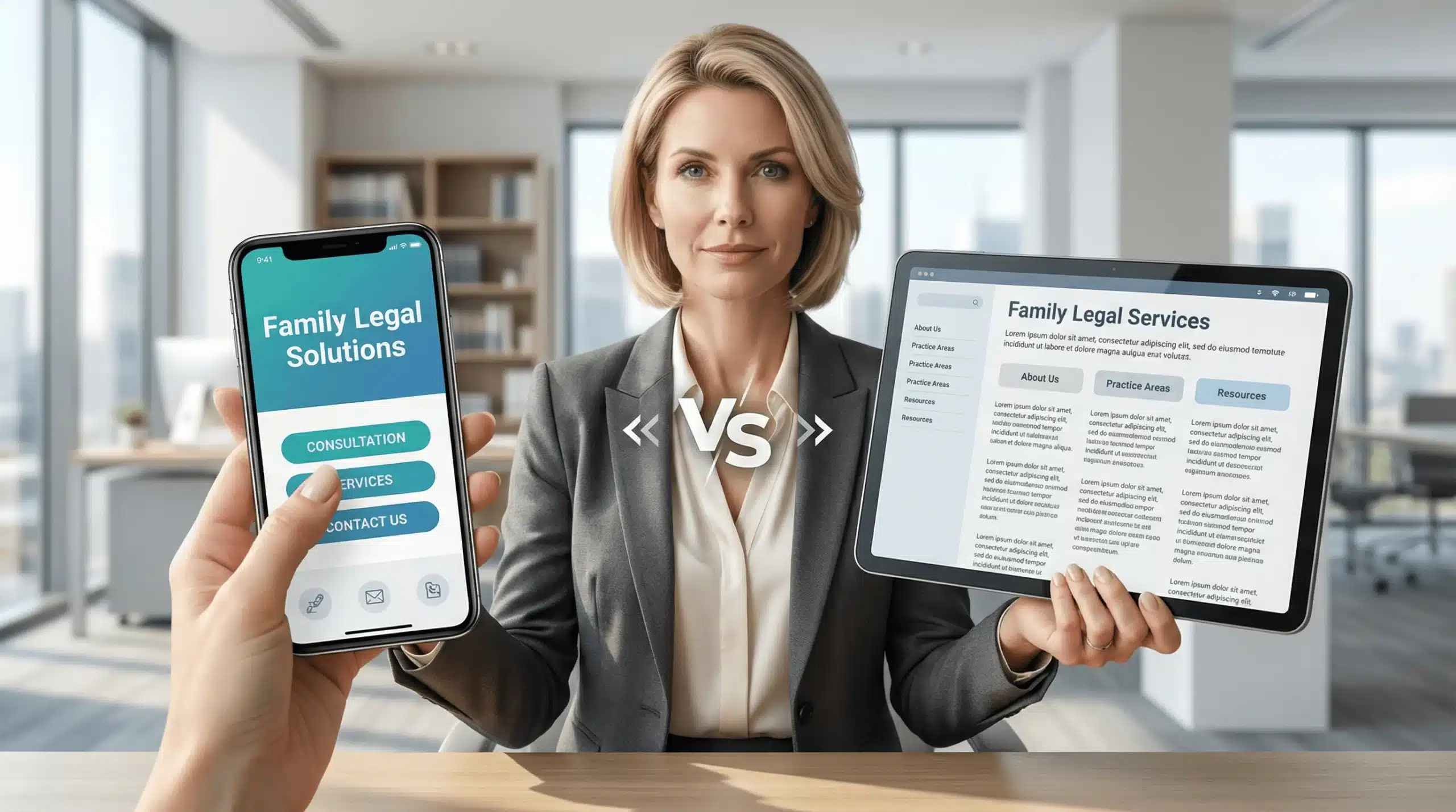
What Makes Mobile First Different from Mobile Friendly
Many family lawyers believe that because their website “works on mobile,” they’re covered. But there’s a crucial difference between mobile friendly and mobile first web design for family lawyer.
Mobile-Friendly: The Old Approach
Mobile-friendly means your desktop website has been adapted to sort of work on smaller screens. Text might shrink, images might resize, and navigation might collapse into a menu. It’s functional, but it’s not optimal.
Think of it like trying to read a textbook on your phone, technically possible, but frustrating and exhausting.
Mobile First: The Modern Standard
Mobile first responsive web design for family lawyer means the site is designed primarily for mobile users, then enhanced for larger screens. Everything about the user experience is optimized for touch interfaces, smaller screens, and on the go usage.
It’s like having a book specifically formatted for your phone easy to read, navigate, and engage with from the start.
Why This Distinction Matters for Family Lawyers
Your clients aren’t casually browsing. They’re stressed, emotional, and need help now. A mobile friendly site might work, but a mobile first approach makes it effortless. When someone is going through a divorce or custody battle, effortless matters.
Testing Your Mobile Web Design for Family Lawyer
You can’t know if your web design for family lawyers works on mobile unless you test it. Here’s how:
Real Device Testing
What to Do:
Test your website on actual smartphones, not just browser simulators. Try different:
- Screen sizes (small phones, phablets, tablets)
- Operating systems (iOS, Android)
- Browsers (Safari, Chrome, Firefox)
- Network conditions (WiFi, 4G, 3G)
User Testing
What to Do:
Ask friends, family, or colleagues (not tech savvy ones regular people) to complete specific tasks on your mobile site:
- “Find information about divorce services”
- “Contact the attorney”
- “Learn about the attorney’s experience”
Google’s Mobile Friendly Test
What to Do:
Use Google’s free Mobile Friendly Test tool (search.google.com/test/mobile friendly)
What to Look For:
- Does your site pass the test?
- What specific issues does Google identify?
- Are there any usability problems flagged?
The Business Impact of Mobile First Web Design for Family Lawyer
Let’s talk about what really matters: how mobile first web design for family lawyer impacts your bottom line.
More Qualified Leads
When your mobile experience is seamless, more visitors convert to contacts. The easier you make it to reach you, the more consultations you’ll schedule.
A well optimized mobile site can increase lead generation by 30-50% compared to a poor mobile experience.
Higher Quality Consultations
Mobile users who easily find information about your services and approach come to consultations better informed and more qualified.
Better informed leads close at higher rates and require less education during initial consultations, saving you time.
Improved Local Search Rankings
Google prioritizes mobile-friendly websites in mobile search results. Since 2019, Google has used mobile first indexing, meaning your mobile site determines your overall search ranking.
Better mobile optimization higher search rankings more organic traffic more potential clients finding you without paid advertising.
Better Client Experience from Day One
The person who struggles with your website will be the same person frustrated by slow responses or confusing processes. Starting with a great mobile experience sets the tone for the entire client relationship.
Higher client satisfaction, better reviews, more referrals, and improved reputation in your market.
Competitive Advantage
Many family law firms still have poor mobile experiences. A truly mobile first approach immediately differentiates you from competitors.
When potential clients compare websites, yours will stand out as modern, accessible, and client focused attributes that they’ll assume extend to your legal services.
At its core, mobile first web design for family lawyer isn’t about technology it’s about empathy and accessibility.
When you prioritize mobile design, you’re saying to potential clients: “I understand that you’re searching for help in difficult circumstances. I understand you might be looking late at night, during a lunch break, or from somewhere you feel safe. I’ve made it as easy as possible for you to learn about me, understand how I can help, and get in touch when you’re ready.
That’s not just good web design for family lawyer. That’s good client service from the very first interaction.